
Fonting It Out
I am not a graphic designer, but I can safely assume that almost every architect is a font-nerd.
It all starts in the second semester of college, when they start teaching you “architectural lettering”. That’s when the craziness begins. You spend countless hours digging up old hand-drawn drawings in the library — or, these days, on Pinterest — looking at how other architects styled their drawings.
You look at those old presentations and working drawings: their title blocks, architectural trees and cars, and human figures. You start appreciating well-designed posters. You stop to stare at logos on storefronts. And, for the first time in your youth, you begin to appreciate the pleasures of pillion riding on a friend’s bike, because it leaves you free to take in the visual extravaganza around the city.
So, last evening, a dear friend from Pune sent me the logo for a new company he’s setting up. It got me wondering whether the way my own firm’s name is written on our letterhead isn’t looking a little old as well. The lettering we had been using with the Urban Arts identity. The earlier Urban Arts lettering.
My dad designed the Urban Arts logo in 1978 — and I absolutely love it — but he never did get around to designing a font to go with it.
Is that even a thing? Do people make logo-fonts?
Given the ample time available to me — and the distinct lack of clients during the current lockdown — I was tempted to give it a go, despite knowing almost nothing about things like kerning, et al. No need to research tracking and leading. An architect can’t be bothered with all that mumbo-jumbo.
Here was the first attempt.
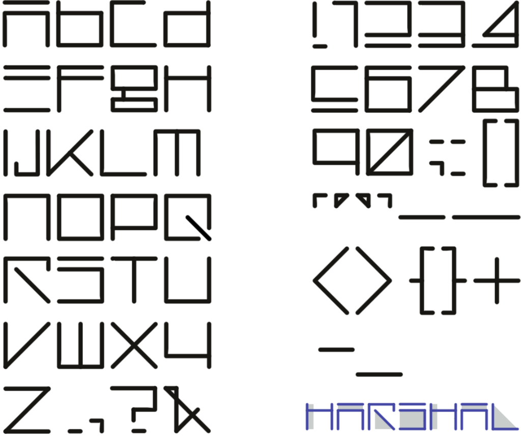
And the stylised name of Urban Arts:

The starting point was already sitting in front of me.
Our firm’s logo was designed by my father in 1978. It is a square mandala, inspired by the plan-forms of stepwells and Hindu temples, and sits on a 16×16 grid. I have always loved it. The Urban Arts mark, designed by my father in 1978. Urban Arts — ESTD. 1978.
So rather than invent a completely unrelated alphabet, I wondered if the logo itself could provide the rules.
I reduced the grid to 4×4 and started drawing letters.
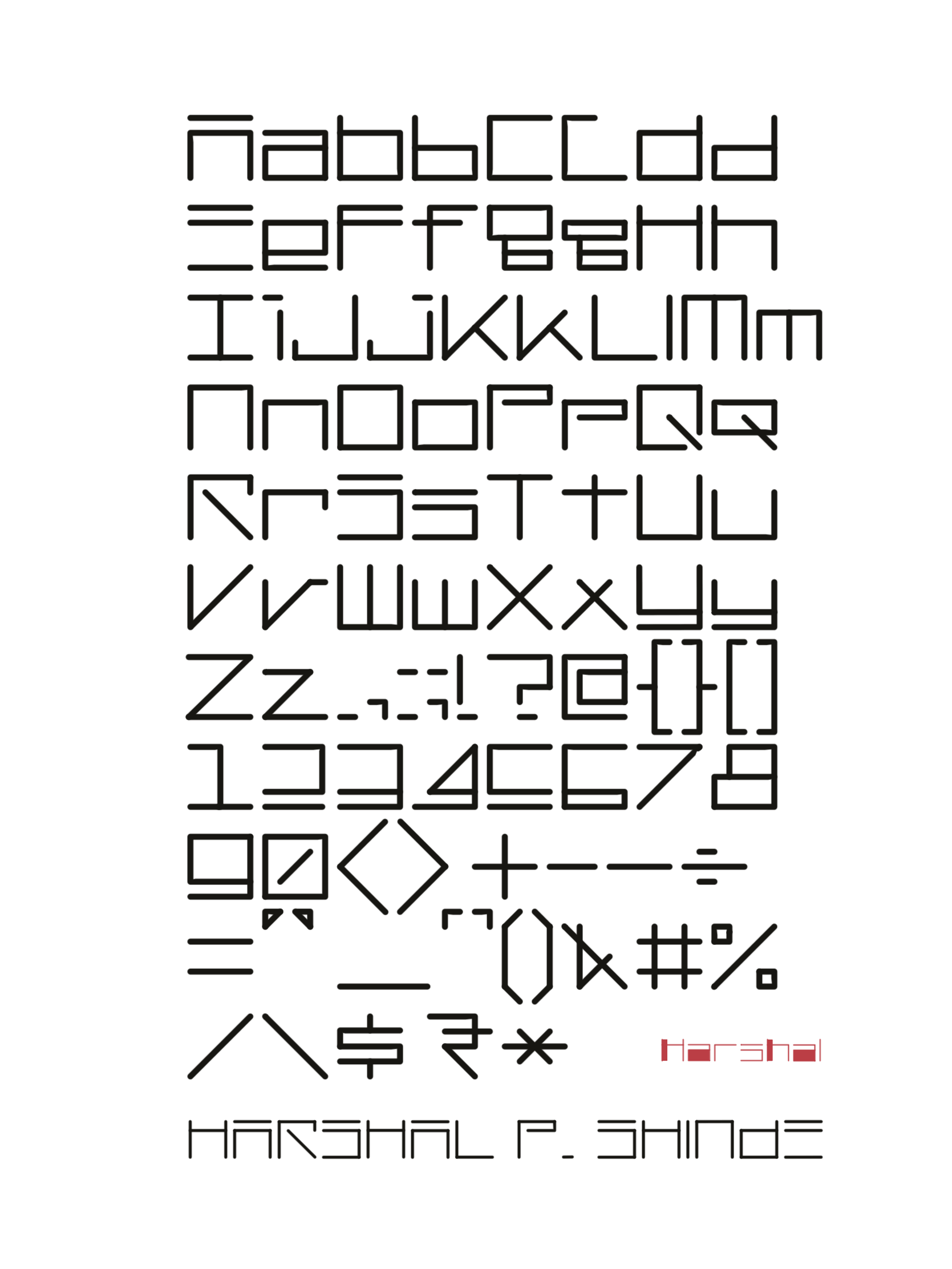
And then, inevitably, I started filling things in. Because, you know, architects desire style and depth.
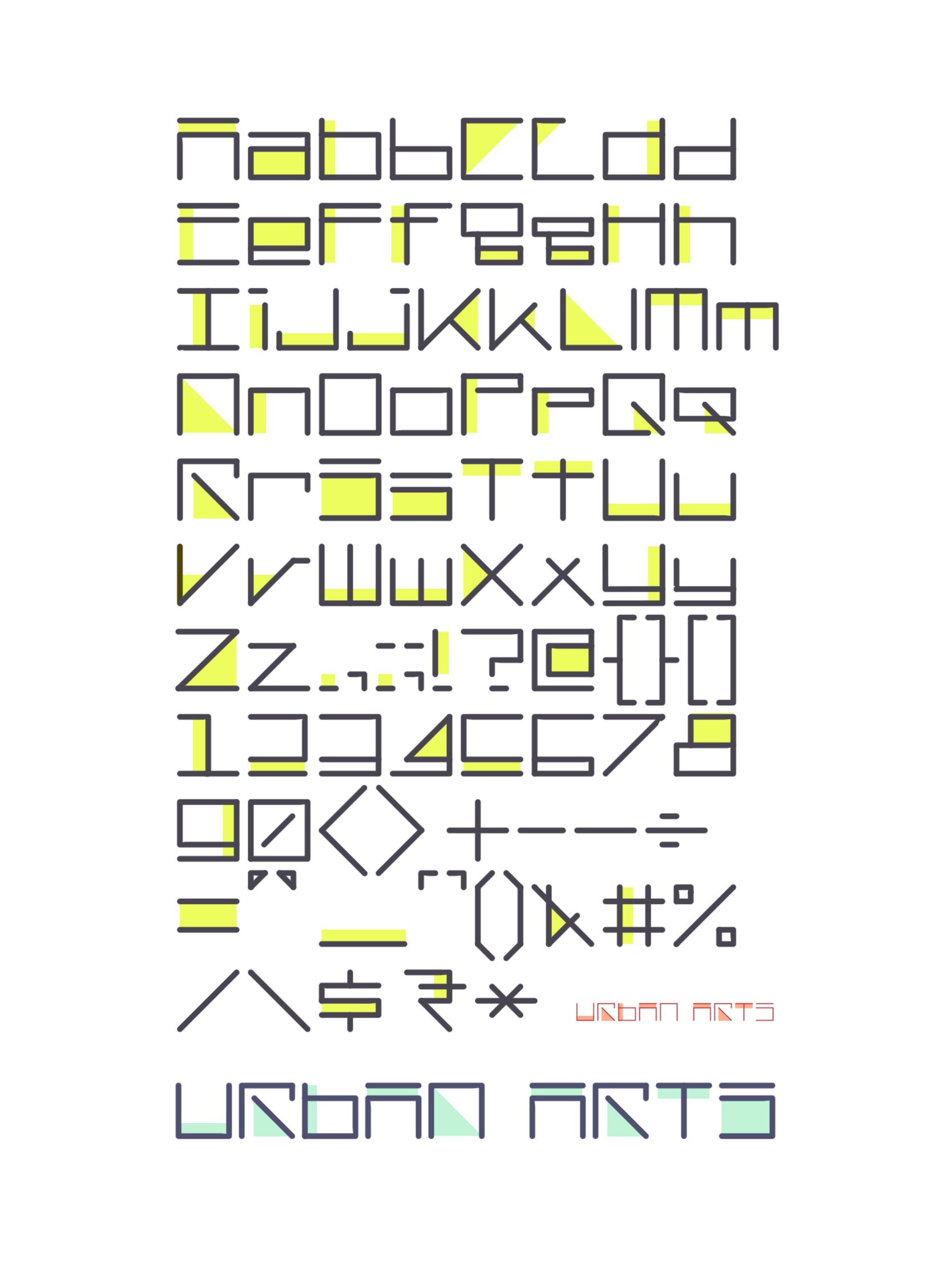
A few alphabets need to be reworked, or tweaked a bit.
But, this is fun ☻
“My Font” — an architectural identity typeface.
